AD DES F10 - MIKE
Wednesday, December 8, 2010
Capabilities Brochure
The design is a simple four column grid. The brochure has two di-cuts and one foiled and embossment. One of the hardest parts about designing this brochure was coming up with all the copywriting for it. I did a lot of research and came up with all of the copywriting my self. I feel that the entire pice has come together quite well.
Sunday, November 28, 2010
Advertising campaign Design
These are my 3 ads for Alpine Valley I
did 2 print ads and 1 Web ad.
I wanted the ads to be simple but
elegant and would display some of
the resorts assets
Sunday, October 31, 2010
Activity Company Stationary Design
At first I was going to do a bunch of
diecuts and embossing on all of the
stationary.
diecuts and embossing on all of the
stationary.
I also designed the back of the letter to be colored
Alpine Valley logo blue so when the left corner to
folds back you can see through the diecut logo
Thursday, October 28, 2010
Activity Company Identity Design
My alpine valley logo roughs
This is the logo I came up with for the activity
I custom made the type to help unify
it's self with the symbol thus creating
a cohesive identity.
I decided to do a clean and simple
design that showcases some of Alpine Valleys
better known features of the resort.
Activity Visual Communication Score
My design brief/ticket for the Activity Visual Communication Score
Pictographs
The final design with some additions
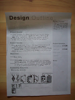
Design Process Worksheets
This is my Design brief/Ticket for my
design worksheets
I decided to redesign the entire set
of worksheets for future use. I tried
to keep the same basic design.
Subscribe to:
Posts (Atom)


